2024 Design portfolio by Yeonju James
Makiya Prika
UX/UI for supermarket membership smartphone app
My Role
• Led overall UX/UI design.
• Created wireframe of end-to-end flows, prototype, visual design mockup, and design specifications.
Team
I worked directly with the Product Manager, Project Manager(client), Engineering Manager, Android Engineers and iOS Engineers.
Timeline
2022.03 - 2022.06
What I accomplished
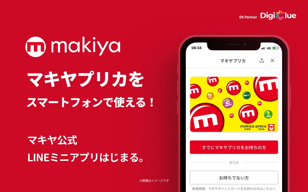
• Participated in the overall development, from the initial concept to the release as a LINE MINI App(Japan’s version of WhatsApp).
• Built prototypes and created multiple versions of the design within a strict time frame.
• Created general-purpose components that can be utilized for other applications.
Overview
Makiya supermarket, which previously utilized plastic prepaid point cards, conducted various analog processes such as membership registration, electronic currency top-ups, and point balance checks. However, due to the increasing trend of cashless transactions and the acceleration of digitalization, customer purchasing behavior and communication methods have diversified. Consequently, the market decided to introduce digital membership cards in response to these changes.
Research and Understanding
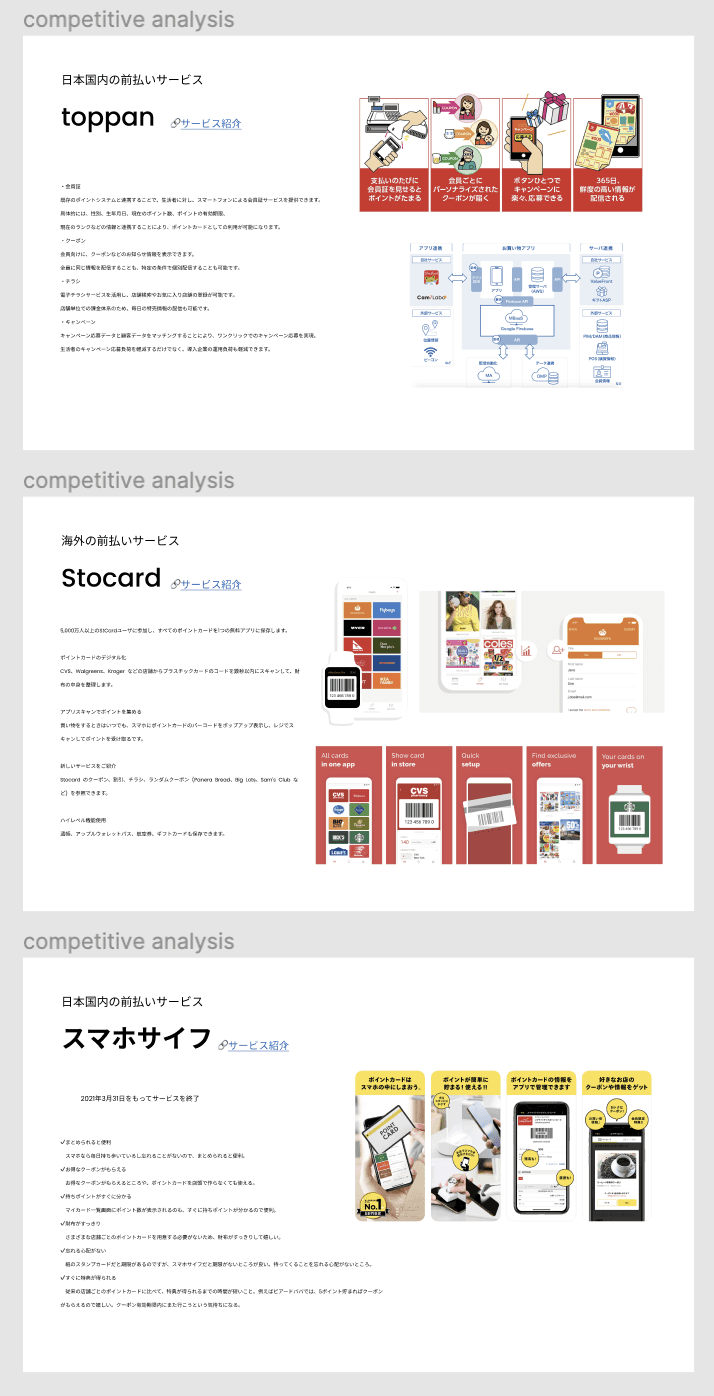
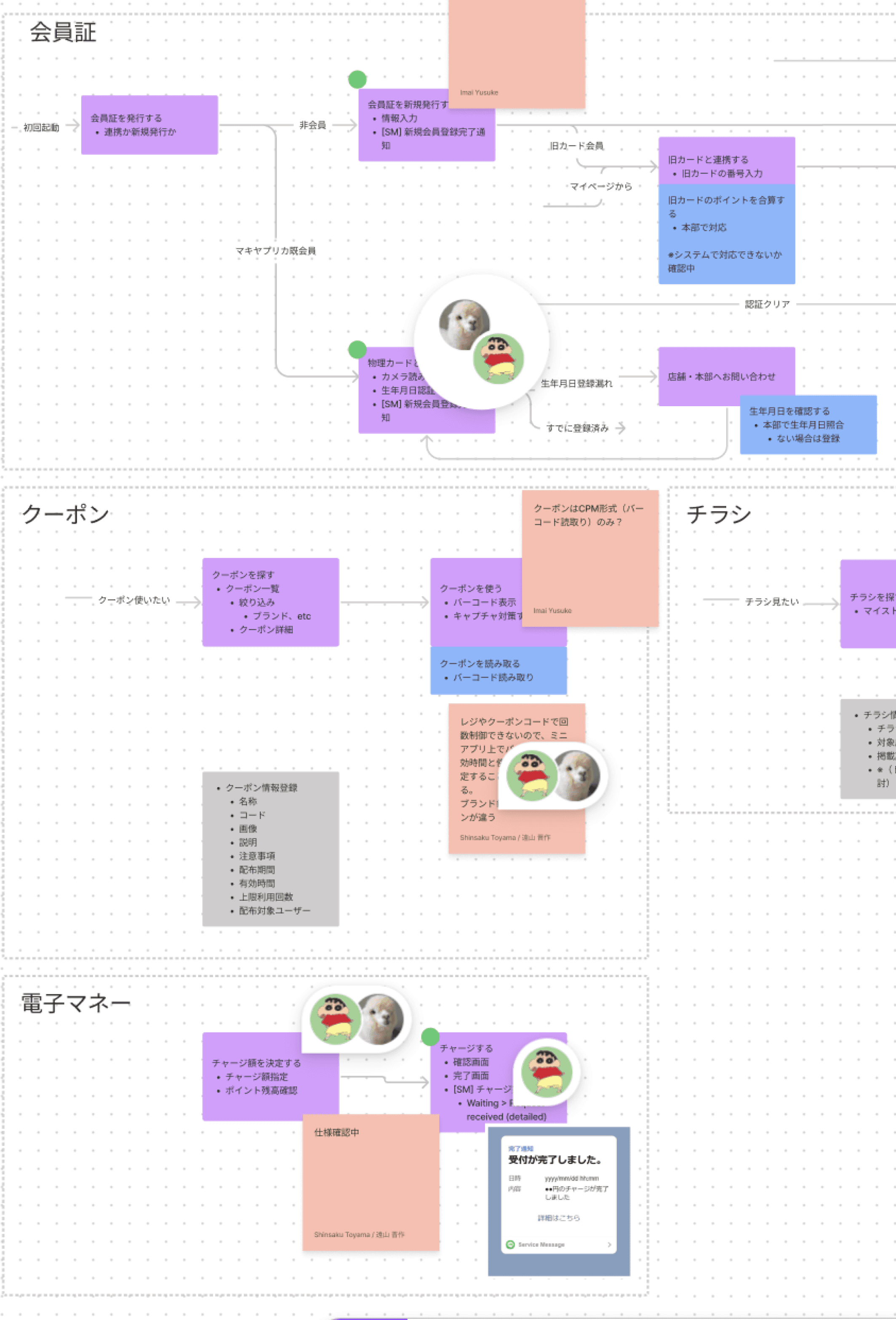
I conducted research on apps similar to the service we aimed to launch, summarizing their strengths and weaknesses. Based on this research, I developed an Information Architecture (IA) and collaborated within the team to organize and define the features through constant communication.
User Interviews
Goal
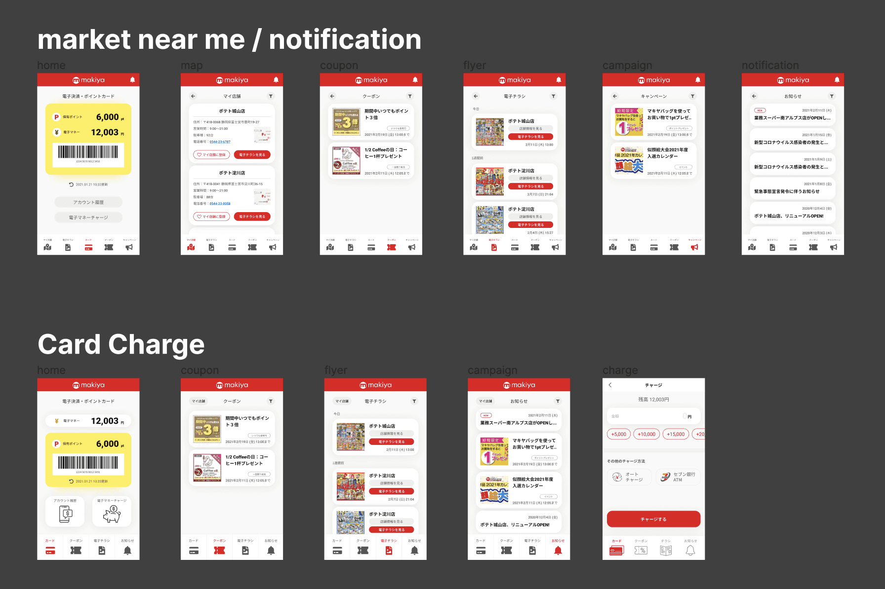
I assessed the user experience of a similar supermarket payment app integrating barcodes and electronic currency. Beyond the app's primary function of payment, I evaluated the effective placement of secondary features such as coupons, flyers, recipes, announcements, etc., and gauged users' understanding of these functionalities.
I conducted interviews with seven potential users, gathering insight on pain-points and potential improvements to the UX. Subsequently, I received feedback directly from users on prototyped wireframes, and integrated the feedback into the final design.
User Interviews Results
Interview Results
• Most contemporary users find the physical use of cards inconvenient, perceiving the process from bag to wallet to card as cumbersome.
When using existing point cards and payment barcodes, significant time is consumed for sign-up or re-login(desire for immediate usability at the register).
• Despite receiving paper flyers and coupons, users often don't look at them and tend not to use them. Even with significant rewards, many tend to store them without actually using them.
Wireframe Review Results
• The placement of the points balance and barcode at the same level creates confusion. It's difficult to determine what is deducted or added through barcode scanning.
• The 'Store Information' tab is unclear in terms of its content before tapping. It is not needed for frequently visited stores that are already familiar, and users rely on Google Maps to find new establishments.
Problem & Solution
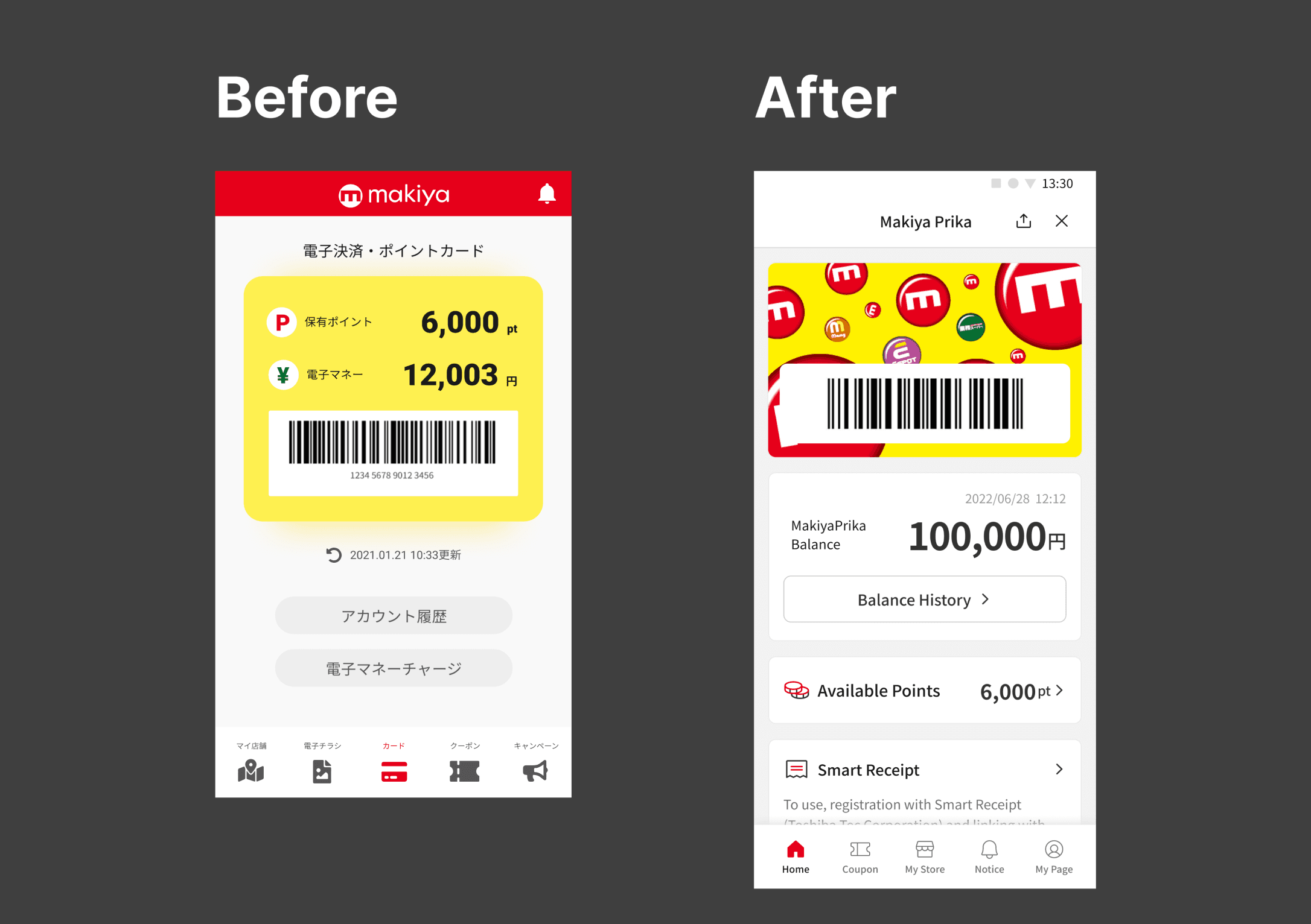
Problem : Home screen layout usability is low.
User : I'm not sure if the barcode scan is associated with points or cash.
Client : I would like to include an image of the card to create a sense of connection with the existing physical card.
Solution : Changed the placement of the barcode and changed layout.
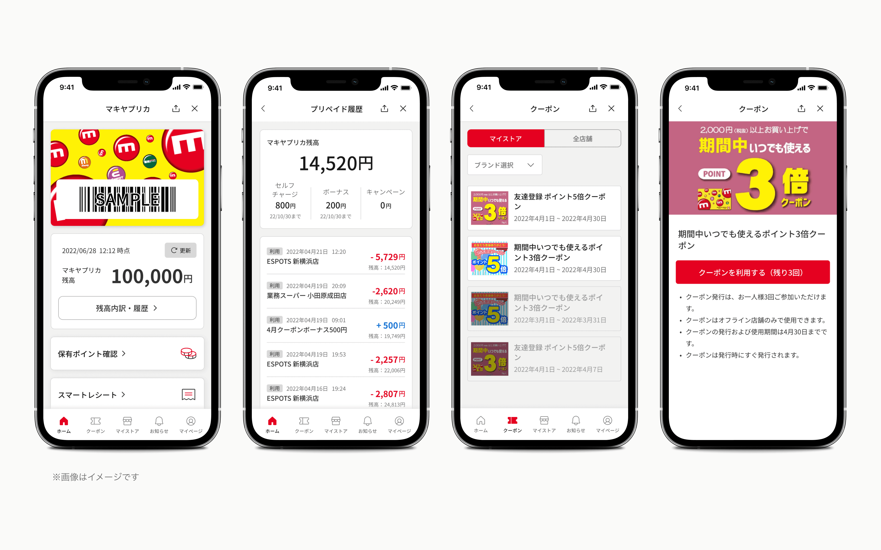
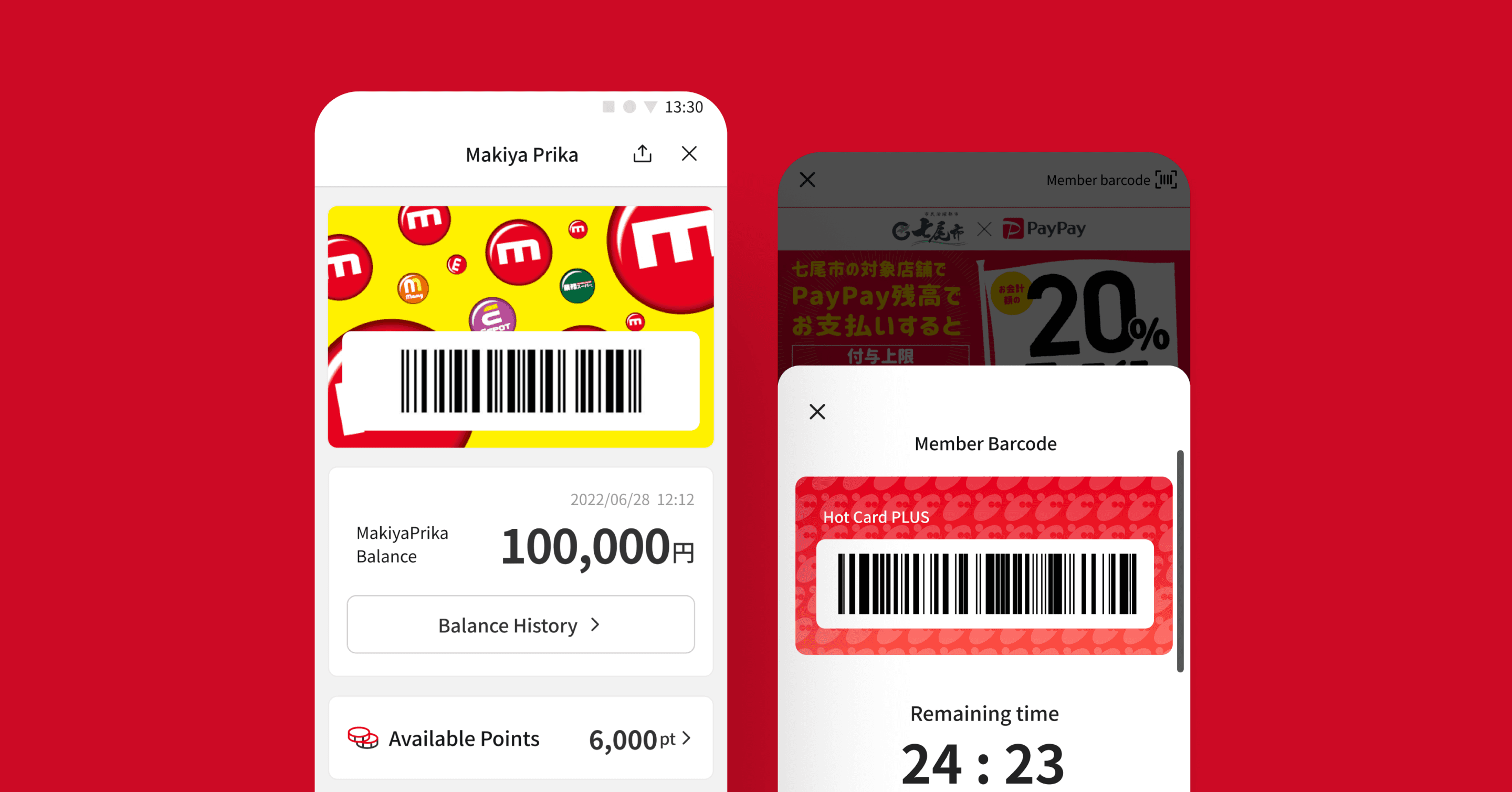
When the app is opened, the barcode that appears immediately has received positive reviews for its convenient payment and point accumulation capabilities. To enhance this, we integrated the card image with the barcode. Initially, the wireframe included a single card containing points, cash, and the barcode. However, we separated and rearranged them, creating distinct cards for Makia balance and valid points.
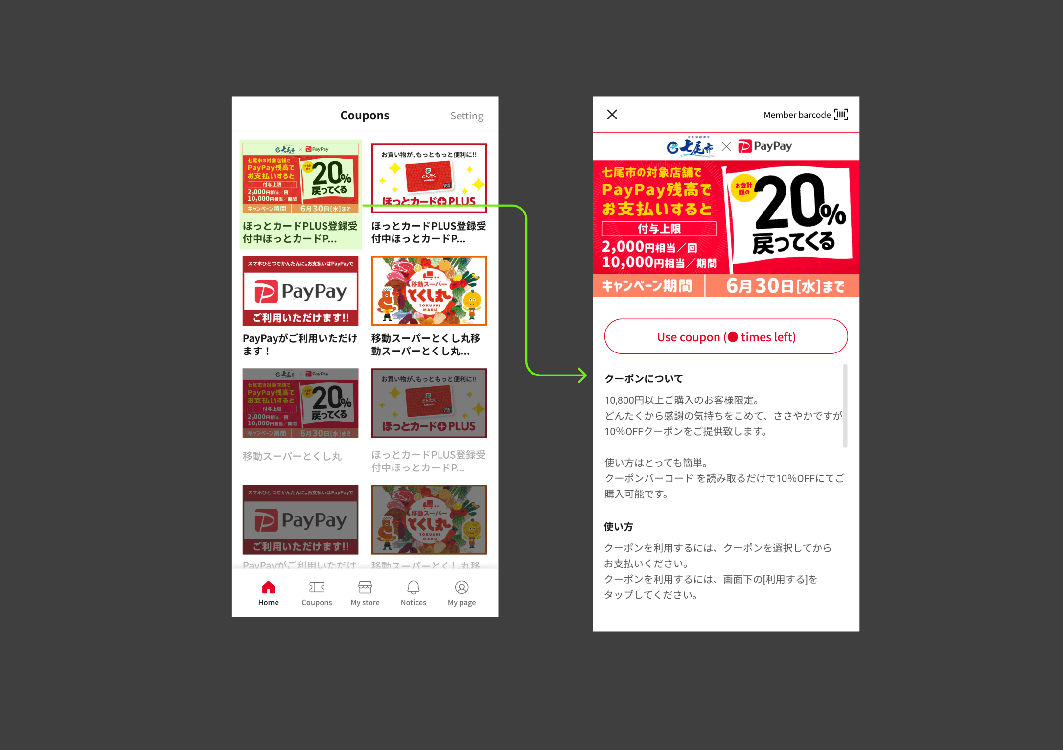
Problem: Coupon usage is unclear.
It's important to notify users about coupons with usage limitations and keep them informed about the number of times the coupon has been used.
Solution : Display the valid usage count on the button when using a coupon.
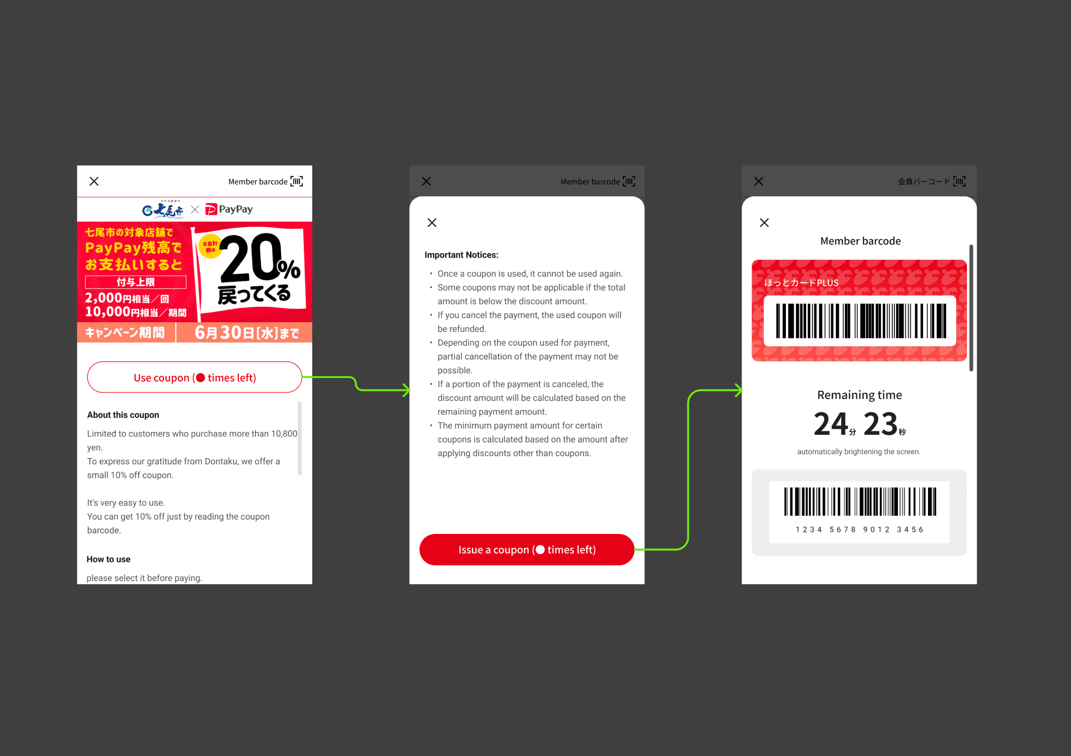
Problem : Difficulty displaying member barcode when using coupons
In the existing wireframe, it's inconvenient to return to the home page after using a coupon due to the need for multiple taps.
A cushion page to confirm coupon usage before applying is necessary (the system deducts the coupon usage count with a button click).
Solution : Added confirmation page for coupon usage and displayed member barcode above coupon for easy access
We have added a confirmation page for coupon usage, and now, after using a coupon, you can instantly display the member barcode at the top of the coupon barcode.
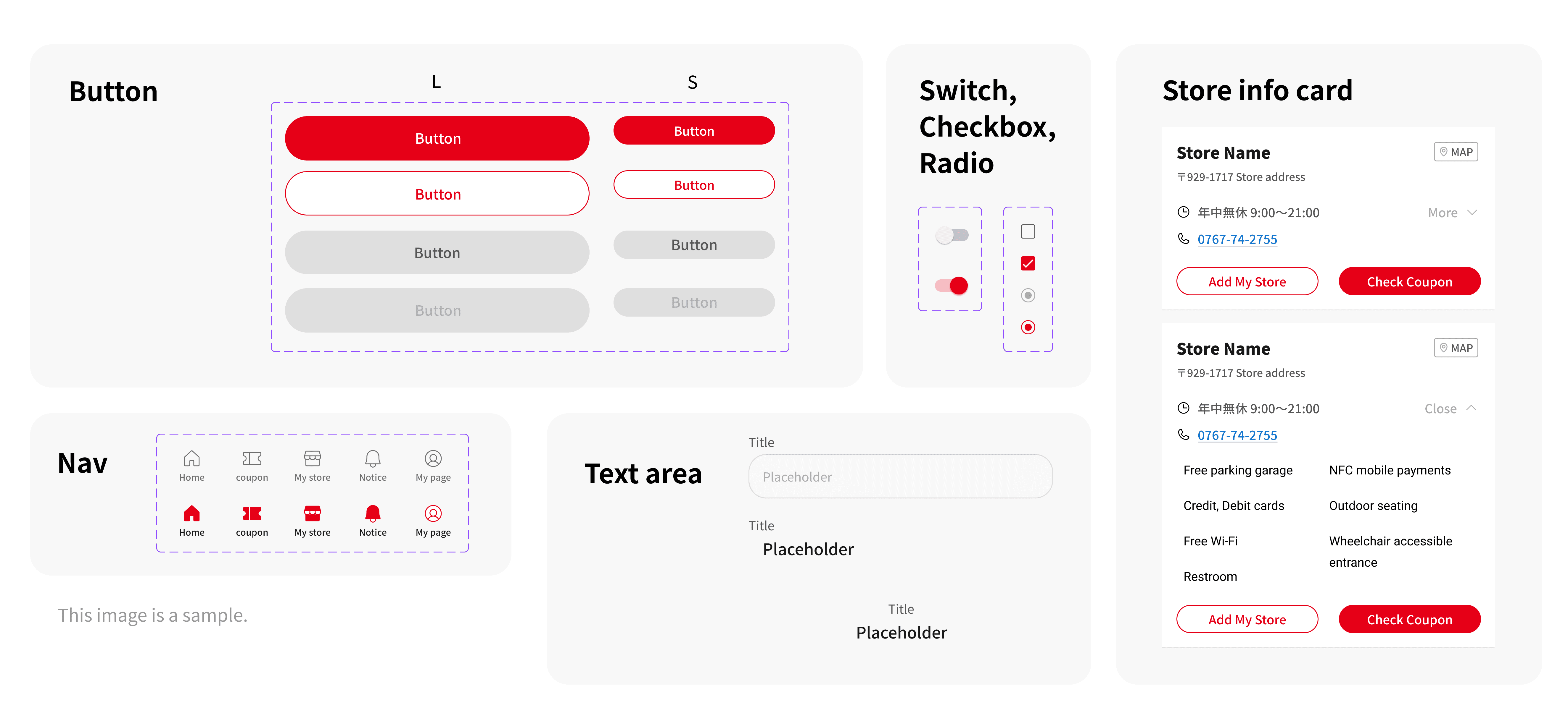
Components
While it may not be an app with numerous features, we have created general-purpouse components to enable swifter wireframe creation when creating proposals for other projects and aiding development speeds.
Final Design
After the release
Acquires 3,000 new members per month. Prepaid payment utilization also rises to 140%
At the 11-month mark since its introduction, the membership of LINE Mini App has surpassed 100,000 users, penetrating a larger audience than expected, with an average of 3,000 new registrations per month.
There has been a shift in the user composition, as LINE Mini App now attracts more users in their 40s and below, in contrast to the traditional plastic card users who were primarily in their 50s and above. This has enabled the acquisition of a customer base from the younger demographic that was not previously explored.
The customer satisfaction among LINE Mini App members has increased, playing a significant role in providing information through the app and LINE official accounts, establishing a strong and familiar presence. The prepayment utilization rate has also risen by 140%, resulting in positive effects on revenue.
What I learned
The importance of user interviews
User interviews conducted internally at the client's office were instrumental in confirming and establishing essential elements and the main page layout of the application during the idea sketching phase.
The importance of tight-knit communication with the client
In a collaborative project, where planning and management were handled by the client and design and development were our responsibilities, we made efforts to achieve common goals through regular internal and external team meetings.
